Please contact me via yisha_liu_1992@yahoo.com

Tuesday 16 September 2014

Aesthetic design process-Paula Scher

The first image created by Paula Scher is one of my favourites. Its simple creation of typography has visually formed the ambiguous perceptual experience by having two alternative interpretations. Other than viewing as a group of letters gathered altogether, we can see it as a woman in a dress lifting her leg, especially the letter 'L' is more of the edge of her dress. According to colour and contrast theories, there are only two colours here-black and white, the complete opposite colours are highly contrasted as the figure and background are distinctively identified. The visual construction is most likely displayed as random that words are exhibited differently on different axis and sizes are varied.

The second image I chose is that I think this design is really vibrant and lively, which is full of elements. The proximity from top to bottom in an orderly fashion from the patterns she used, some words are underlined, some are not, but they are displayed within a block-shaped manner which diagonally designed based on modular system. Adding to the colour theory which she used two primary colours-red and yellow, and neutral colour black and white is to construct the meaning of naturalness. But the use of red and yellow for some letters is to highlight some important elements.

The third image is one of the typical examples of showing radial visual construction when all elements are extended from the focal point, the red circle on the left in this case. The highlight of red to the name 'Paula Scher' with enlarged size over other elements ultimately stands out. The background is using the neutral colour-grey which further highlights the group of elements, some are bold, some are less visible by using white. This design largely uses Gestalt's principle-continuation in my point of view, when the radial shape leads my eyes from top to bottom in the flow.

Thursday 4 September 2014

Final postcards design overview


Mind map - Feelings (Hope, peace, love, purity)


I have selected all the components to ideally represent my core concept in this design. As the theme is feelings, I needed to consider the composition I used to illustrate this well. Taken the first postcard as an example, I use large amount of blue to represent the sub-theme of 'hope', also to place the letters 'O' and 'Y' in the middle, is to form a person as if he/she is stretching arms to embrace freedom. The highlight of the letters by using the complementary colours in 4 postcards is in order for viewers to distinguish the abstract shapes of the letters mixed. Colours are essential to be using to relate back to my chosen theme, hence, I carefully selected each set of colours, including the 'white' colour to make my design seem more dynamic. Talking about the saturation values, the two dominative colours such as dark green and red/pink-ish colours in the second postcard, are needed to be highly saturated, whereas the supportive colour, grass green is tint with 30 to 40% of saturation. This is regarding to the colour contrast theory which the darker colour in the background is strongly contrasted with the brighter foreground.

Wednesday 20 August 2014

Colour combinations/selections

Primary colours:

Blue, red and yellow are the primary colours using in this image. According to the principle of colour theory, those three are the essence of colours without any additional colours. It creates a sense of simplicity towards fashion design due to the full saturation and brightness, which constitutes a high level of colour value.

Secondary colours:

The second image is to illustrate the concept of secondary colours in photography. Purple, orange and green are the colours achieved by the combination of red and yellow, red and blue, and yellow and blue. Hence, using secondary colour has increased the variation but simply with less contrast.

Tertiary colours:

The third image is an example of showing tertiary colours. As we can see, the colours have made this photo more vibrant with its fantastic combination of choices reproduced by the mixture of both primary and secondary hues. Other than this, the background is largely filled in with orange and red colours, whereas the windows are with cold colours-green and blue as though a highlight of the window frames.


Analogue colours: 

The two photos above are to demonstrate the use of analogue colours when the chosen sets of colours are the ones close to each other on the colour wheel. Examples such as light pink, rosy red, and dark red in the first photo, which mainly shows the variation of a hue either produced by the addition of black(shade), or white(tint). The second photo is another example showing this concept within the range of cold colours. Lime, grass green and blue are the typical use for gradual change in naturalness.


Complementary colours:

The last two photos carry artistic values by using only two colours to show the ultimate contrast. But in this case, the choice of two colours are the ones located opposite each other on a colour wheel. In the first photo, the use of orange and blue is as a division, separation, border or edge to its demonstrated purpose aesthetically. And the second photo is another way to show contrast as red strawberry in the glass has greatly contrasted with the green background. 

Wednesday 13 August 2014

Examples of Gestalt theory


Similarity- From this image, the square in the centre is as similar as the ones around it as they all are formed with both 8 horizontal and vertical lines, except that the colour of the middle one is different, as well as the shape of the lines.


Continuation- Second image is to convey the idea of continuation from how it directs the viewer from left to right by firstly forming a solid line, it changes to a series of circles which gradually shrink to a tiny dot in the end.


Closure- The simple design of the letter 'B' is to show the law of closure as each component (3 components here: solid thick stem, two semi-circles) is not fully attached to each other but leaves some gap in between, but viewers are still able to recognise this is a shape of 'B'.


Proximity: A simple design in this image is to show the law of proximity from how all the squares are united as a group. We recognize they belong together because the same sizes as well as the gap between each of them are exactly the same.


Figure and ground- The circle in the middle is as a focal point when its colour has made it stand out in the image, whereas the background shows contrast to it with light green. Adding to the trapeziums from the corner of the big triangles towards the centre, the figure in the middle will be even highlighted more.


Raification- This image carries the law of raification by leading the viewers to have a more experienced perception as this design contains more than one sensory stimulus. The letter T, and the two blocks next to it will be the first image can be seen, and the constructive 2 in white colour is as a hidden image that dissects other elements in black.


Multistability- The last image is to visually express the ambiguous perceptual experience by generating an alternative interpretation when viewing the image. We can either see a peacock is spreading its tail on the side, or an incomplete heart shape that is formed by the arcs.

Tuesday 12 August 2014

Gestalt Law on images

1. From town to person


The first image is amazingly expressive according to one of the laws based on Gestalt's. It's one of the typical examples of showing the concept of continuation because it occurs when the design directs the view to the gradual change of other objects. Accordingly, this design naturally forms a fascinating and interesting viewing experience as houses change to cubes, then to leaves and finally to a complete shape of a person. Apart from that, the principle of proximity is another principle that I find it applies to this image as well. Though it's not as obvious as how the continuation has shown, somehow a group of cubes, the ambiguity of the formation of leaves are perceived as a group.

2. What can you see? Naked couple showering or skull?

Second image was purposely chosen to be one of the kinds I like for optical illusion. First of all, the figure and ground is definitely applied to this image when the naked couple are the focus of this image, in contrast to the background where it shows their action has taken place in this eerie shower room. What makes the figure so clear is that they are placed in the middle. Not much proximity here except that the bricks formed as the shape of the arc at the background can be perceived as an unity. Lastly as a typical optical illusion image, it tends to generate dynamism within this image when we are uncertain whichever image comes first. This is what we call multistablity, as it contains two alternative interpretation, the naked couple, and the skull which they form a part of it. Hence, viewing experience for each person can be varied.

Thursday 7 August 2014

Final design

In doing this assignment, I found that I've learned a lot throughout this process. The first thing that comes up in my mind is the basic elements of how to structure fonts. With some preknowledge of fonts design, I did know how to keep all the letters consistently in a way to make them look like they come from the same set of alphabet. But this has always been hard when I actually did it, because I was thinking that in order to do so, I had to keep checking the previous letters I've made so to achieve this result. And I found my way to fulfil this requirement. To learn how to keep the letters symmetrical is another major point in design. The easier task to do is to make both sides, for example, letter 'A' to be equally structured with same shape, length or thickness of lines and all. I double checked each and every time after I finished constructing one letter, so to ensure they look balanced. Lastly the poster is comparatively simpler. The digital version is much easier to handle since I could use variety of tools to beautify the shapes and lastly, put them together. However, the most difficult part is that to achieve the smooth edge of each letter, it was quite time consuming doing that. I tried to make the poster closely relate to the theme of the title- droplet by adding the blue gradient to the background as a pool of water, and the circles with different colour range to highlight the waves droplets make...

Friday 25 July 2014

Fonts design


Reason why I created my first font is because I seriously couldn't come up with something professional in the first place, so I tried to look for some inspiration when I looked around the classroom. A rectangular-like USB was right in my face and that it has urged me to draw something similar to its shape, so I gave it a go, and tried to bring up with something simple and readable for my font design. Also, this font design is closely related to the ancient Egyptian style which the solid materials such as stone, is one of the most usable natural resources being used to construct their sense of living or any forms of communicative representation. Hence, I wanted to create a feeling of olden-fashioned to my design. Other than that, one of the most popular constructions in Egypt are the pyramids. As you can see I simply added the 'apex' to the letter 'A', is to represent the symbol of it.


The second design I came up with the idea of traffic sign in the beginning. But then, I was having this second thought to introduce the most popular sign-the arrow to my design after I thought that the whole sets of traffic signs are too much. Hence after I have decided to make it as my theme, I started to work on the shape of my design. In order to reinforce the theme of this design, the overall design of the font is using arc and straight line because we normally see direction comes along with arc and straight lines. Also, adding some arrows across the letters will make it less dull.


The last but not least, the one that chosen to be my best design so far will be the one I put in my final visual diary. The only thing in my mind at that time was the word 'faded' for some reason. However, as we are not allowed to do any shadings to our hand drawings, I could only represent this idea by designing letters with gradual shrunken shape from the top to bottom. I hope this makes sense to you, what I mean by that is the individual piece is formed with a water drop like shape. Guess what, this design is based on my water bottle. Thanks to my water bottle gives me this great idea! Not to mention that this has finally accepted by Helen who told me that this is the safest one I should do. It's simple, readable, and consistent... 

Wednesday 16 July 2014

Type:research

Arts, is still seen to be a mysterious term for me to explore more and more for the time being. I found it quite fascinating to start with the concept of 'typography'. As it's known, symbols and characters are the essentials, which we've learnt how all of these make sense to our own understanding. That being said, fonts carry fundamental cultural aspects in how it presents in a way.

Today, I'm going to make some evaluation of 3 fonts I like and the other 3 that I don't like, which extracted from this free website dafont.com, to demonstrate how particular representation of fonts can be interpreted differently.

To graphically display the 6 types of fonts (3 for likes, 3 for dislikes), the following screenshots are the examples, followed by a review/reasons of why/what I find them good and/or bad.

LIKE


1. Nervous
There are several reasons I like about this font-nervous. First is that this type of font is readable, which is the most important factor for the concept of typography. Other than this, it isn't a flat font at all, but its representation does produce the nervous feeling by the addition of light dark lines across the letters where they're needed. Trembling is felt through the design of this font aesthetically and that it's suitable for most of the car or medical magazines to reinforce the overall intense condition.

2. Killam
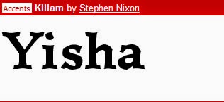
This is the second font I like amongst thousands of fonts I've seen so far. I don't exceptionally like overly fancy design. Sometimes simplicity does the trick. In this case, this font is not particularly meant to be captivated the reader's attention in their first glance. However, its easier to be constructed and considered to be one of the most readable fonts you may see from the novels, letters, or any forms of printed reading materials. Last but not least, I've also noticed the base and the top of each letter is with little curves, which is seen to be something intriguing to my discovery. 

3. Oz'sWizard
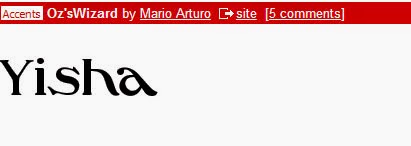
The last font I'll share here is Oz'sWizard. The same reason as above, it's easier to be constructed and tidy without decorative elements surrounded which makes it so much more readable compare to others. Besides, it creates a dynamism towards its design principle as the placement of the first two letters are firmly stood, the following letters are seemingly lying horizontally towards the x-axis, which creates a spiral shape or a slightly distorted feeling artistically can be used for fashion magazine covers. 

DISLIKE


4. Basica
With all the likes above, now comes with the ones that I don't like about. The first font I would not suggest to use in any written materials is Basica, which is too bulky to put into any lengthy writing. Its thickness will be the major problem that causes the difficulty of reading experience for readers. Also, another reason that I dislike about Basica is that they all are square-like with sharp edge in which I feel that this is one clumsy looking font to use. 

5. Prism
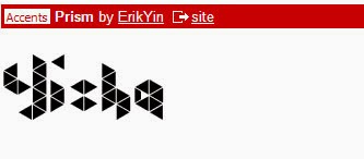
This font is also not constructed clearly when it may send a cloud of confusion to readers in the first sight when they read, as the design for each letter is not lied on the same baseline, and that the focus when reading the text might be elsewhere. Though admittedly, the formation of the blocks is seen to be a creative idea of the theme 'Prism', it's too casual to be used for formal printed materials.

6. Kandinsky
The third font that I dislike is Kandinsky. It doesn't fulfil the most basic purpose of typography when it's hard for readers to distinguish the letters at times due to missing parts or the likelihood of overlapping on every letter. Even though it carries an aesthetic value in constructing a good sense of arts, the complication that has overdone will draw most of the attention away during reading experience.