Today, I'm going to make some evaluation of 3 fonts I like and the other 3 that I don't like, which extracted from this free website dafont.com, to demonstrate how particular representation of fonts can be interpreted differently.
To graphically display the 6 types of fonts (3 for likes, 3 for dislikes), the following screenshots are the examples, followed by a review/reasons of why/what I find them good and/or bad.
LIKE
1. Nervous
 There are several reasons I like about this font-nervous. First is that this type of font is readable, which is the most important factor for the concept of typography. Other than this, it isn't a flat font at all, but its representation does produce the nervous feeling by the addition of light dark lines across the letters where they're needed. Trembling is felt through the design of this font aesthetically and that it's suitable for most of the car or medical magazines to reinforce the overall intense condition.
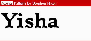
2. Killam
 This is the second font I like amongst thousands of fonts I've seen so far. I don't exceptionally like overly fancy design. Sometimes simplicity does the trick. In this case, this font is not particularly meant to be captivated the reader's attention in their first glance. However, its easier to be constructed and considered to be one of the most readable fonts you may see from the novels, letters, or any forms of printed reading materials. Last but not least, I've also noticed the base and the top of each letter is with little curves, which is seen to be something intriguing to my discovery.
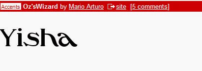
3. Oz'sWizard
 The last font I'll share here is Oz'sWizard. The same reason as above, it's easier to be constructed and tidy without decorative elements surrounded which makes it so much more readable compare to others. Besides, it creates a dynamism towards its design principle as the placement of the first two letters are firmly stood, the following letters are seemingly lying horizontally towards the x-axis, which creates a spiral shape or a slightly distorted feeling artistically can be used for fashion magazine covers.
 DISLIKE
4. Basica
 With all the likes above, now comes with the ones that I don't like about. The first font I would not suggest to use in any written materials is Basica, which is too bulky to put into any lengthy writing. Its thickness will be the major problem that causes the difficulty of reading experience for readers. Also, another reason that I dislike about Basica is that they all are square-like with sharp edge in which I feel that this is one clumsy looking font to use.
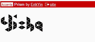
5. Prism
 This font is also not constructed clearly when it may send a cloud of confusion to readers in the first sight when they read, as the design for each letter is not lied on the same baseline, and that the focus when reading the text might be elsewhere. Though admittedly, the formation of the blocks is seen to be a creative idea of the theme 'Prism', it's too casual to be used for formal printed materials.
6. Kandinsky
 The third font that I dislike is Kandinsky. It doesn't fulfil the most basic purpose of typography when it's hard for readers to distinguish the letters at times due to missing parts or the likelihood of overlapping on every letter. Even though it carries an aesthetic value in constructing a good sense of arts, the complication that has overdone will draw most of the attention away during reading experience.
No comments:
Post a Comment