Please contact me via yisha_liu_1992@yahoo.com

Friday, 25 July 2014

Fonts design


Reason why I created my first font is because I seriously couldn't come up with something professional in the first place, so I tried to look for some inspiration when I looked around the classroom. A rectangular-like USB was right in my face and that it has urged me to draw something similar to its shape, so I gave it a go, and tried to bring up with something simple and readable for my font design. Also, this font design is closely related to the ancient Egyptian style which the solid materials such as stone, is one of the most usable natural resources being used to construct their sense of living or any forms of communicative representation. Hence, I wanted to create a feeling of olden-fashioned to my design. Other than that, one of the most popular constructions in Egypt are the pyramids. As you can see I simply added the 'apex' to the letter 'A', is to represent the symbol of it.


The second design I came up with the idea of traffic sign in the beginning. But then, I was having this second thought to introduce the most popular sign-the arrow to my design after I thought that the whole sets of traffic signs are too much. Hence after I have decided to make it as my theme, I started to work on the shape of my design. In order to reinforce the theme of this design, the overall design of the font is using arc and straight line because we normally see direction comes along with arc and straight lines. Also, adding some arrows across the letters will make it less dull.


The last but not least, the one that chosen to be my best design so far will be the one I put in my final visual diary. The only thing in my mind at that time was the word 'faded' for some reason. However, as we are not allowed to do any shadings to our hand drawings, I could only represent this idea by designing letters with gradual shrunken shape from the top to bottom. I hope this makes sense to you, what I mean by that is the individual piece is formed with a water drop like shape. Guess what, this design is based on my water bottle. Thanks to my water bottle gives me this great idea! Not to mention that this has finally accepted by Helen who told me that this is the safest one I should do. It's simple, readable, and consistent... 

Wednesday, 16 July 2014

Type:research

Arts, is still seen to be a mysterious term for me to explore more and more for the time being. I found it quite fascinating to start with the concept of 'typography'. As it's known, symbols and characters are the essentials, which we've learnt how all of these make sense to our own understanding. That being said, fonts carry fundamental cultural aspects in how it presents in a way.

Today, I'm going to make some evaluation of 3 fonts I like and the other 3 that I don't like, which extracted from this free website dafont.com, to demonstrate how particular representation of fonts can be interpreted differently.

To graphically display the 6 types of fonts (3 for likes, 3 for dislikes), the following screenshots are the examples, followed by a review/reasons of why/what I find them good and/or bad.

LIKE


1. Nervous
There are several reasons I like about this font-nervous. First is that this type of font is readable, which is the most important factor for the concept of typography. Other than this, it isn't a flat font at all, but its representation does produce the nervous feeling by the addition of light dark lines across the letters where they're needed. Trembling is felt through the design of this font aesthetically and that it's suitable for most of the car or medical magazines to reinforce the overall intense condition.

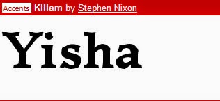
2. Killam
This is the second font I like amongst thousands of fonts I've seen so far. I don't exceptionally like overly fancy design. Sometimes simplicity does the trick. In this case, this font is not particularly meant to be captivated the reader's attention in their first glance. However, its easier to be constructed and considered to be one of the most readable fonts you may see from the novels, letters, or any forms of printed reading materials. Last but not least, I've also noticed the base and the top of each letter is with little curves, which is seen to be something intriguing to my discovery. 

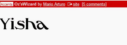
3. Oz'sWizard
The last font I'll share here is Oz'sWizard. The same reason as above, it's easier to be constructed and tidy without decorative elements surrounded which makes it so much more readable compare to others. Besides, it creates a dynamism towards its design principle as the placement of the first two letters are firmly stood, the following letters are seemingly lying horizontally towards the x-axis, which creates a spiral shape or a slightly distorted feeling artistically can be used for fashion magazine covers. 

DISLIKE


4. Basica
With all the likes above, now comes with the ones that I don't like about. The first font I would not suggest to use in any written materials is Basica, which is too bulky to put into any lengthy writing. Its thickness will be the major problem that causes the difficulty of reading experience for readers. Also, another reason that I dislike about Basica is that they all are square-like with sharp edge in which I feel that this is one clumsy looking font to use. 

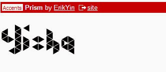
5. Prism
This font is also not constructed clearly when it may send a cloud of confusion to readers in the first sight when they read, as the design for each letter is not lied on the same baseline, and that the focus when reading the text might be elsewhere. Though admittedly, the formation of the blocks is seen to be a creative idea of the theme 'Prism', it's too casual to be used for formal printed materials.

6. Kandinsky
The third font that I dislike is Kandinsky. It doesn't fulfil the most basic purpose of typography when it's hard for readers to distinguish the letters at times due to missing parts or the likelihood of overlapping on every letter. Even though it carries an aesthetic value in constructing a good sense of arts, the complication that has overdone will draw most of the attention away during reading experience.